8 Menu Design Tips for Restaurants in 21/22
Looking for the best menu design ideas and tips and hacks for your restaurant?
Good restaurant effective menu designs can improve a customer's dining experience by assisting them in making satisfactory choices and stimulating their hunger. A menu, on the other hand, is more than just a list of the items available in a restaurant; it is an advertising tool capable of communicating a restaurant's identity while also driving profit - if it is well designed.
We'll go through a few graphic menu design ideas that can assist your restaurant clients to enhance profit margins. You should be aware that you may go hungry.
#1 Keep an eye out for eye scanning patterns
Restaurants have long assumed that customers' eyes are naturally drawn to the "sweet spot" in the upper-righthand corner of the menu, and have placed their higher-profit products there. According to new research, customers read menus like a book, beginning at the top left corner.
#2 Only use photos when absolutely necessary
Food photos are more typically linked with junk mail ads and massive chain restaurants like Denny's, rather than fine dining establishments. If images are used, they must be of extremely high professional quality, which might be pricey. In general, it's better to leave the customer's imagination to determine the quality of the food, because not all food photography will appeal to everyone.
#3 Consider the use of boxes
Boxes are employed by restaurants to highlight a group of menu items and are frequently used to promote dishes with the largest profit margins, such as pasta and other carb-based foods.
#4 Use illustrations if possible
Try employing illustrations instead of pictures; they are more likely to be universally appealing and can assist communicate the restaurant's individuality.
#5 Menu colours should be appropriate
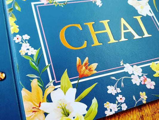
Colours should be chosen based on your target audience and the restaurant's theme. Because different colours have distinct psychological impacts on people, your colour scheme will help define the tone of a restaurant while also drawing attention to certain food items. The menu design of Maudie's Tex Mex Restaurant is a modern take on the traditional warm colour scheme associated with Mexican cuisine.
#6 Typography on the menu
A restaurant's brand will be communicated through effective typography, which will result in a legible menu. The typeface chosen may be influenced by a variety of practical considerations, such as the amount of text required to fit comfortably on the page. Using multiple typefaces to distinguish titles and descriptions of menu items, for example, may aid in guiding clients through the menu.
Do you need a menu for your restaurant, cafe, or bar?
#7 Don't put too much emphasis on pricing indications

Customers should not be very mindful of their expenditures. Customers are more inclined to spend more when currency signs are absent, according to studies (be sure to check out our menu pricing strategies).
#8 Divide the menu into sections that make sense
Arrange items progressively and in logical categories, beginning with the appetisers, to make it easier for customers to find dishes.
![How to make restaurant menu design? [Effective menu design]](http://www.worldwidemenus.com/cdn/shop/articles/20210113-162825_2.webp?v=1678938714&width=1100)
