You basically should be mindful of the significance of designing a good takeaway menu because it can boost your sales. Consider that its design, layout, and colour scheme can bring in heaps of profits when put together proficiently. You wouldn’t want to utilize a poorly-designed list of your food and beverage items because it can drive customers away.
Your menu is the first accessory that potential guests look through before placing their orders. It is a make-or-break factor in creating the first impression. It is therefore crucial that you create it efficiently.
In this aspect, you can refer to takeaway designs online, but below is a guide for tips that you can integrate into your project.
8 Restaurant Takeaway Menu Tips and Ideas
Pay good attention to branding
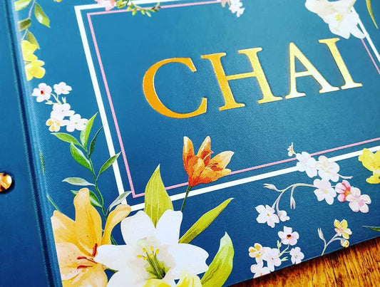
You may have already created your restaurant logo following your establishment interior. All these elements taken together should be translated onto your menu. Primarily, a well-designed listing of your food and restaurant items should include:
- The logo of your brand
- The appropriate colour design
- The most effective font style
- The complementing theme
Your menu should accord with the look and feel of your establishment. It should feel like it belongs there and reflect your brand; that's why it should be designed impeccably.
The list should be easy to scan
Customers want fast and efficient service, so your menu must be able to assist them in making quick decisions. In a span of 109 seconds (the average time diners spend reading the menu), your guests ought to have a good grasp of the food choices. See that the section headings are clear and that the dish titles can easily be found. If you want to highlight specific items, lay them out in decorative frames and attractive graphics.
Showcase high-margin dishes by placing them in the accessible sections
With the fast scanning time rendered by guests reading the menu, they are likely to look at only the first and last menu items.
It is apt that you indicate your high-margin items at the beginning of the final sections of your selection because these are the biggest sellers. Take particular advantage of the “sweet spot,” which is the top right-hand corner of the menu. Place the most expensive items of your restaurant here because this is where the diners’ eyes tend to gravitate.
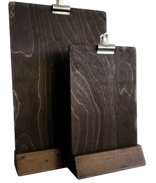
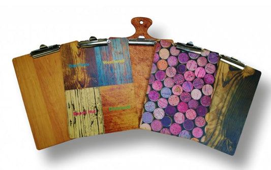
Attractive graphics and fonts are better laid out in this “sweet spot.” Incorporating decorative elements onto these restaurant menus’ “eye magnets” is genuinely strategic in making the right sales. While at it, you can likewise display your choices on wooden menu signs.
Use the right colours to influence the emotions of your customers
Colours affect people’s decisions subconsciously, and you can harness this ability. You can send your customers’ attention to certain menu choices with the right colours. It can actually trigger their appetite.
Plenty of colour combinations can be used on restaurant menus, but the most commonly used are red and blue, especially for seafood. You can apply this technique in establishing the hierarchy of food and beverage choices on your menu.
Lay it out with a limited number of photos
It used to be that every item in a menu was paired with a single photo. But this technique is no longer effective. The use of photos in your food selection should be sparse in that one is enough for every page. This can essentially increase your sales by 30%.
In this sense, you have to choose your photo to display wisely. Put that of your most mouth-watering and inviting dishes. Enliven them with the most stunning colours and texture.
Be creative with your food names and descriptions
Add a creative touch to the descriptions of your food and drinks. Be poetic instead of just narrating their ingredients. You’ll need this to make your items more alluring, especially the expensive ones.
The nature of a take-out menu is somewhat different, and lengthy poetic descriptions may not be necessary. Still, you can infuse descriptive language such as “homemade,” “rich,” “spicy,” “creamy,” and the like now and then. They can surprisingly have your customers feeling satisfied when they leave.
Displaying your high-end dishes on your menu via creative language can offset their exorbitant prices because it can make your guests feel that they are getting their money’s worth.
Make the prices less visible
It’s tricky when you take into account prices in your food list. If done without proper planning, it can drive your customers away or compel them to order the cheapest items instead.
The key to this is to remove the currency sign on your menu. This way, the burden of buying dissipates when your patrons pay for their orders.
Nevertheless, the cost simply cannot be removed from your list, so you can otherwise make them inconspicuous or less visible by placing them below the items and in a smaller font.
With this technique, you can get your guest to buy the items first before they even notice the price. And if you use persuasive language, you can, in effect, render the prices of your items irrelevant or less relevant with the customers very willing to pay for them.
Use a pricey decoy to make your other items appear reasonable
An expensive decoy added to your list can make the higher prices of your business appear reasonable. This strategy is effective and can be employed if your selections are costlier than the competition.
Add one exorbitantly-priced item on your menu so that the rest of your food items will seem cheaper. Consider in the same way that high price also implies high quality when it comes to restaurant food.
Conclusion
Using these eight smart psychological hacks as practical tips and ideas for creating a good takeaway menu can make your business stand out from the crowd. Get and apply them right, and you’ll be all set to reap huge profits for your astounding work.
Read also;
