Crafting your menu is a crucial endeavour in managing your restaurant. Your menu design is an accessory in it that can greatly impact your profits. You thus have to be particular in that aspect, such as avoiding some common mistakes. These include adding too many, or not using any pictures at all, or incorporating a scattered menu design.
This faux pas can actually be a turn off to your guests and steer them away from your business. How do you make an effective menu design?
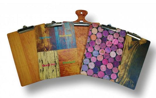
The following are creative and practical menu covers and design ideas to guide you.
Creative and Practical Menu Design Ideas
1. Your restaurant menu should be easy to read
Dig this. There’s a restaurant that’s dimly lit, which is part of its aesthetic. Some would initially think that this is a blunder because it will cause inconvenience to the customers when they read the menu. However, the establishment has resolved this with a brilliant idea, and that is having the menus shown on lit screens!
That’s a rather extraordinary idea, but on the practical side, you can avoid using hard-to-read fonts, excessive culinary jargon, and very long descriptive content on your menu.
Essentially, you should make your menu cover and design simple because, on average, your guests spend only 2 minutes reading them.
2. Don’t present too many choices. It can overwhelm your customers
Do away with the temptation of including too many food choices on your menu. Adding a surfeit of dishes on your list would only overwhelm your guests and lead to serving mediocre dishes and a waste of food.
Instead of offering 50 dishes that you’ll tend to serve ordinarily, why not provide 15 food selections that you can plate up flawlessly? Ideally, you can arrange 6 to 8 choices in every section.
This strategy gives your customers the leeway to make solid choices, making them more comfortable instead of stressed out.
3. Your menu cover and design should be cohesive and sensible
Basically, your menu style and the theme of your restaurant should be well-coordinated. If, for example, your business is on a beachfront location, your menu design ought to accord with it. The same goes if you run an upscale steakhouse in the city.
4. As much as possible, your menu should be one-page
Your customers, for the most part, have the tendency to order food items that they see on the first page of your menu. Other than that, they are not keen on the idea of flipping pages to look for their choices.
Apparently, customers are apt to assume that menus are only one page, and it’s a smart option to just make yours that.
Make the list of your food items short and concise. That’s a prudent way to go.
5. Consider profitability, but stick to affordable pricing
The prices of your food selections should reflect the costs that you incur when you make them. See to it that your customers will be willing to pay for the rates of your restaurant.
Manage your ingredients as well. That is, use them in multiple dishes so that you avoid overpricing your dishes.
6. Use colour psychology to make your menu design effective
Utilize psychology tricks to elicit your customers’ impulses to buy and increase your profits.
For instance, research has shown that customers first notice the middle and top corners of the menu upon reading it. It makes sense then that you have your most popular dishes printed on these areas.
Deliberately make use of colours, too. Colours have a powerful ability to communicate. Below are some tips:
- Red elicits hunger.
- Yellow grabs attention.
- Blue calms the mood.
- Green portrays nature and is suitable for healthy food restaurants.
How do you want your customers to feel when they read your menu and dine in your restaurant? Choose the right colours to draw out the appropriate reactions.
7. Strong descriptions are a powerful strategy
Brief descriptions should be indicated under each dish, but they should not be there only for the sake of it. Make your food items sound good in your menu descriptions- let your guests salivate to taste them.
Do something more than stating the ingredients, but rather portray enticing descriptions of the items in your menu. Although using a few words, your descriptions should be over-the-top and popping the page.
8. Add photos accordingly, not excessively
Adding one or two photos to highlight your fantastic dishes suffices instead of putting in excessive displays that can appear tacky. Photos on your menu aren’t exactly a necessity, but you can do them right to boost your profits.
Stock photos are not ideal for your menu, but it is smarter to present real-life images of your dishes in the best light, angle and quality. As much as possible, pictures of the food in your menu should be snapped by a professional photographer.
9. Highlight your best-selling items
Typically, restaurants highlight the best-selling selections by inserting a small icon, such as a star, next to them. Doing this makes it easier for guests to make their decisions, preventing them from getting stressed or uncomfortable. Then again, apply this strategy sparingly by highlighting not more than 2 choices per section.
10. Keep your focus on the food, not the price
When your customers look at the menu, they should notice how delicious the dishes are, not their expensive prices. For instance, you can print the name of the dishes in bigger fonts than their prices. This makes the cost secondary to the central focus which is ordering the food.
The tastiest-sounding dish ought to be their first choice than the cheapest items.
11. Clearly indicate the food content of your menu selections
It’s an off-putting experience when your guest orders a delicious dish only to return it because they realize that they are allergic to its ingredients. You should thus make sure that food contents like these are listed on your menu descriptions.
Dietary and allergen declarations should be transparent on your menu so that you refrain from food waste and loss of profits.
Conclusion
These menu cover and design ideas can significantly inspire you to create the best layout for these crucial tools for your restaurant.
You may also like; What Should be on a Cafe Menu
